The Intentional Use of Color in the Waldorf Classroom
I have such fond memories of the Waldorf school I attended as a child. One of my most vivid memories is of the color of the classrooms where I learned to love learning. The first time I took my son to a parent and child class at a different Waldorf school, I noticed the same colors and shades welcoming me into the classroom. I observed, with the other parents, how our babies were calm and happy in the room, even on days they hadn’t napped or were teething. What was this magical aspect of the classroom? I knew it must have something to do with the color. What is the intention behind the use of color in a Waldorf classroom?
The first place I looked for information on the intentional use of color in the Waldorf classroom was Steiner’s own study of color. Rudolf Steiner, founder of the study of anthroposophy and the Waldorf movement, studied color extensively. Much of his adult life he worked to expand upon Goethe’s theory on color. From what I’ve read he actually intended to establish color and art as a spiritual science. This work was controversial and something he worked on for most of his career. To break this down in the most simple way possible: If you look at a color wheel you can decipher what primary, secondary, and tertiary colors are. It is the way colors interact in relationship to each other and the feeling they inspire that is at the heart of Steiner’s theory.
I think most people reading this will find Steiner’s spiritual observations pretty out there. I personally don’t subscribe to a whole lot of his beliefs. As I have discussed in other posts, I’m not an anthroposophist, but I am a graduate of a Waldorf school. Anything I write about Steiner and anthroposophy is from my own research as an interested parent, not something I learned as a Waldorf student. I was not taught anything about Steiner or the study of anthroposophy as a Waldorf student. I will probably go deeper into this in another post but I want to be sure to continue to make this distinction since there seems to be so much confusion about this on the internet. My in-laws were Waldorf teachers before retiring so they help fill in the gaps of my knowledge quite a bit. I understand this is an extensive tangent, but I want to be transparent in giving my full perspective whilst diving deeper into some of these interesting topics.
Ok coming back to color…….
How is color used in the Waldorf classroom? As I touched on earlier, the feeling you experience when you walk into a Waldorf classroom is palpable.
In fact the colors of all the classrooms within a Waldorf school are chosen intentionally to suit the developmental age of the child walking into that classroom. Early childhood education rooms, kindergartens, and first grades are almost always a soft red. Usually all classrooms are painted using a faux technique which allows the color to “breath” and appear more alive. Why the red? Young children are active, fiery, and always on the move. Children actually experience the complementary color of what they see so when they’re in a room of soft red, they actually experience green which is a calming soothing color. In second grade, the classroom is often an orange, evoking a calming blue. In third grade or about age nine, children experience change, a separate feeling from the world. (This could be the topic of a whole other post.) This is very normal but can sometimes make a child feel sad, or isolated. The third grade classroom is painted yellow and sometimes green. Now the child can experience true color and the yellow is cheerful. Usually green would be used for the fourth grade classroom and is inviting. Blues are used for grades six, seven, and eight and inspire free thinking. Having the classrooms evoke a feeling that compliments where the child is developmentally, allows them to feel more comfortable and secure in their learning environment so that they can be happier and learn more effectively.
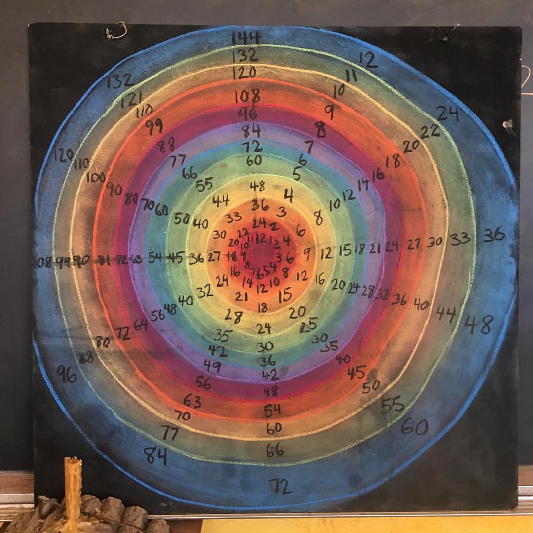
Within the Waldorf classroom children also experience color as part of their educational process. I found all kinds of posts on the internet of beautiful chalkboard drawings, done by Waldorf teachers, illustrating lessons about all sorts of topics. I was eager to learn what the rational was behind why you would use yellow, let’s say, for a certain number or red for a verb. What I learned, is just as in Steiner’s color theory, it is more about how a teacher would use the colors together to create a relationship between the subject matter. So when distinguishing between odd and even numbers, different colors would be used, but it wouldn’t be as important as to which colors would be used. Where color can be used more specifically is to depict a relationship between subject matter based on the nature of the colors. For example when teaching grammar, a teacher could use red in a way that illustrated a verb, because verbs are active, and orange for adverbs since it is close to red and a color that relates to activity. This could be a way that teachers might use color in the classroom.
I have a really specific memory of color as a young Waldorf student. About once a week, in the first and second grades, we would paint as a class. We would paint in watercolor, which if you’ve ever tried it, really quite challenging, although that wasn’t the intention of our lessons at all. I very clearly remember the glorious feeling of freedom creating something. Up until that point, I never felt so inspired to create so freely. Last week, when I was speaking with my father in-law, a retired Waldorf teacher, about color, he brought up these early painting lessons. He said the whole purpose of these early painting lessons is to just experience the color. Often the whole lesson would be centered around a story. You might start with blue. Blue would move around, and blue might be sad. Then you might include yellow and yellow would come in cheerful and want to play with blue. In my memory, the story didn’t act as an instruction so much as a way to maintain my focus. In a child’s mind, ( I can remember experiencing it) this was an incredible invitation to create. To allow for a personal exploration of what you could do and then what you would see. It sounds so simple to an adult, but to a child, these experiences can be a world of magic.


4 Comments
waldorfy
Waldorfy family!
I wanted to include a couple neat links for you related to this article:
First is a great read about Stiener’s Theory of Color:
https://transitionconsciousness.wordpress.com/2015/08/02/artistic-consciousness-and-rudolf-steiners-theory-of-colour/
Here is a link to a YouTube video were Waldorf Teacher Liane Anistas speaks about the walls of the Waldorf classroom:
https://www.youtube.com/watch?v=xwI4aLTzkXc
Bella Luna Toys sells a Lazure painting kit if you would like to implement these techniques into your home. Lazure is a little different than the faux technique, super beautiful if you’ve never seen it: https://www.bellalunatoys.com/products/lazure-painting-instructions-kit
Connie Rinaldo
Wonderful post. Thanks for your insights.
Taylor
I’m so thankful I found your IG & blog. Do you have any resources around small children experiencing the complementary color to what they are actually seeing? Thank you!
waldorfy
I think anything about Steiner’s color theory would be a good place to start, but I’ll look for something more specific for you.